For 160over90
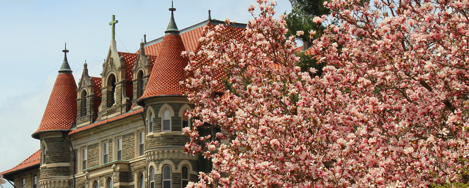
These pages show the basic styles and range of layout options. This is a good place to start to understand how we are handling the design of the site for our first stage work and launch.
I'm suggesting two levels of review.
1. Suggestions for completion by initial launch
Below are issues we believe need to be addressed but I'm fine with hearing whatever else you feel needs to be done before launch:
- Review the pages in the navigation to the left. Give feedback to any part you wish.
- Masthead – Is the Griffin mark and the present use of the words "Chestnut Hill College" a good solution or can you suggest something better? (I think we could connect the top and lower navigation with the logo/mark and make the top navigation a little more obvious.)
- Subsites - View the subsite link to the left and read my explanation of this capability. Address the quesion listed there.
- Right sidebar -- I would like the right sidebar to be used for action steps. Depending on pages, it can be Apply, Visit, Give, Request Info, Signup for e-Newsletter, etc. We can use buttons, links, blocks or mini-forms. I'd love suggestions for 160 about how this could look.
- Footer – Once again, I need to improve and make decisions about the links that should be there. Should it span the entire screen? We may just have a basic solution for now and improve down the road.
- Responsive -- the site will be responsive but that will be completed after we finish the rest of the design.
The actual website. We still have plenty of stuff to add to the site and I need to add branded photos but I can discuss some with you in our meeting. For example:
- Homepage -- Text is still not ready in the blocks and the link to 8 CHC Promises goes to a page that hasn't been completed. (This is a concept we are still working on and needs work.) The News and Events tab will eventually work something like the drexel.edu site. Let's talk about what works and doesn't work.
- Majors Page - View the sample major page to the left. We had thought about having an icon related to each major area but wasn't sure if this was worth it. Should we have thumbnails for each section? Could they be something standard?
2. Suggestions for improvement over the next year.
- If you begin thinking about staged improvements over the upcoming year, please record those thoughts. I definitely want this site to evolve and 160 to play a role in its evolution.